GoSmile: Elevating a Brand through Web Design
THE CHALLENGE
GoSmile needed a new website that would help differentiate their growing line of products, reflect the beautiful design of their products and improve user experience.
GoSmile is the premier, luxury tooth whitening brand. From their beautiful packaging and the elegant product designs, it’s immediately clear that they’re a step above the average teeth whitening you encounter in supermarket. However their website had lagged behind on proprietary software that restricted the functionality of the website and made updates extremely challenging. They wanted to move to Magento, get a responsive design, and, in the process, re-conceptualize their website.
—
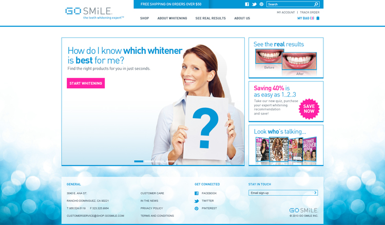
Before:
The initial website design did not reflect the sophisticated design of their products.
—
—
01.
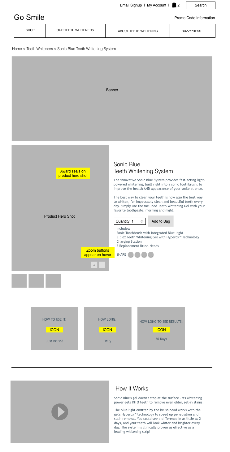
Since the brand had long since overgrown their old website, we started by organizing the content and information architecture of the site. Once that was agreed to, we began to wireframe the individual pages.
—
—
02.
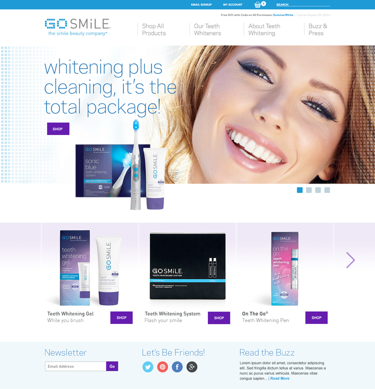
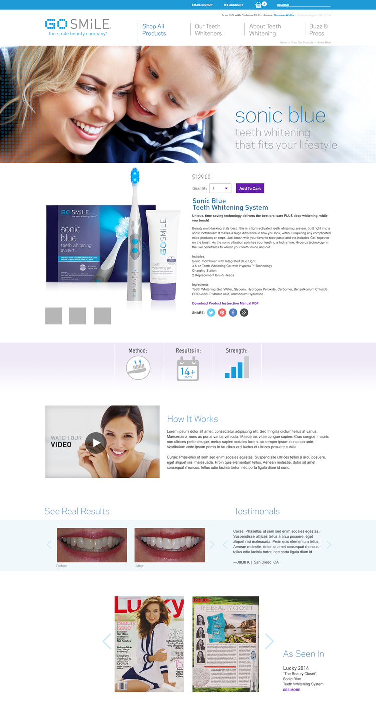
Visually, the first priority was to align the site with the look of the products. In the previous version, the website was contained in a boxy template that didn’t to reflect the airy, modern designs of the products. By incorporating the feel from the packaging and products, we opened up the designs and replaced the boxy with more expansive, modern designs that were unique to their brand.
—
—
03.
Functionality-wise we wanted to allow multiple paths for users ranging from experienced users who want the quickest path to purchase, to informational browsers looking to read more about the products. We identified and eliminated several unnecessary steps in their previous website and were able to streamline and improve the experience for both types of users.
—
—
04.
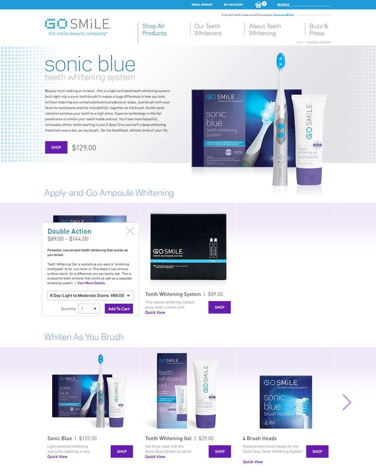
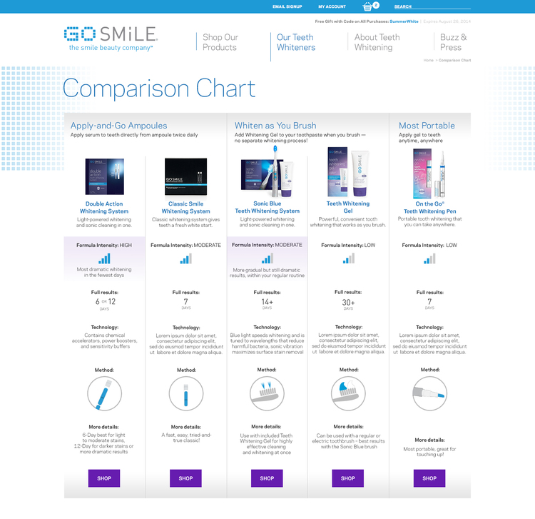
However one of the key challenges we quickly identified was distinguishing between the products. GoSmile has grown substantially and has an array of core products, all of which solve essentially the same problem: whitening teeth. While they each have unique selling points, these weren’t immediately clear to website users. To avoid self-competition and a push to the lowest-price, it was crucial to create a clear system of distinguishing the products.
The previous website used a quiz to walk users through a series of their preferences before giving them a product recommendation. While quizzes can be a useful strategy, it required a high level of engagement and the recommendations felt opaque — they failed to orient users to the relative advantages of one product vs another.
We identified three areas to differentiate based on:
- Intensity — the amount of total whitening that could be achieved.
- Time — the length of time required to achieve the desired result.
- Method — how the product is used.
We created icons for each and included this information on the product pages and the navigation drop down menu. To give an overview at a glance, we also compiled it into a comparison chart to give customers a quick, easy to understand overview of each product.
—
—
05.
Based on these distinctions, we built personas for each product. For example, Teeth Whitening Gel is a low intensity, easy-to-use method perfect for a busy mom who wants to maintain her smile but doesn’t have time to add an additional step to her routine. Meanwhile, the more intensive, time-consuming method Double Action Whitening System would be perfect for a bride preparing for her big day who wants to look her best in the shortest amount of time. Based on these personas, we created banners with lifestyle images and taglines to match.
—
In the end, the redesign improved user experience, created unity between the product, packaging and website and differentiated the products to users.
FROM THE CLIENT
"The site is so beautiful and the launch was smooth.
Thank you for all the hard work and giving us such a great new look. It was a pleasure to work with you and look forward to working with you more in the future."
— Sunday Perez, Director of Marketing
DETAILS
Design Concept & Strategy
Wireframes & UX Design
Visual Design using Adobe CS
Development in Magento

