Brain Picking: Handsocks Homepage Analysis
How can I can increase conversions on my website?
This week I got a question from Casey at handsocks.com. She’s selling her adorable baby mittens from both Amazon and her own website, and while she’s seeing good sales numbers from Amazon, on her own website there’s . . . let’s say, some room for improvement.
So she wrote to me for suggestions on how she could improve her site and start converting her visitors into paying customers.

First of all, what she’s experiencing is not at unusual. If you think of the sheer volume of traffic coming through Amazon each day, it would be very difficult for a startup or business to compete with that. Also, Amazon has had years to build up their reputation and trust. It’s fairly common to see more sales coming through Amazon or other third party sites.
That being said — I do think there are things she could do to improve her website and start seeing more sales through it.
Before we get started, I want to first give a brief overview of the idea of a sales funnel and how it works on your website, then dive into her website specifically.
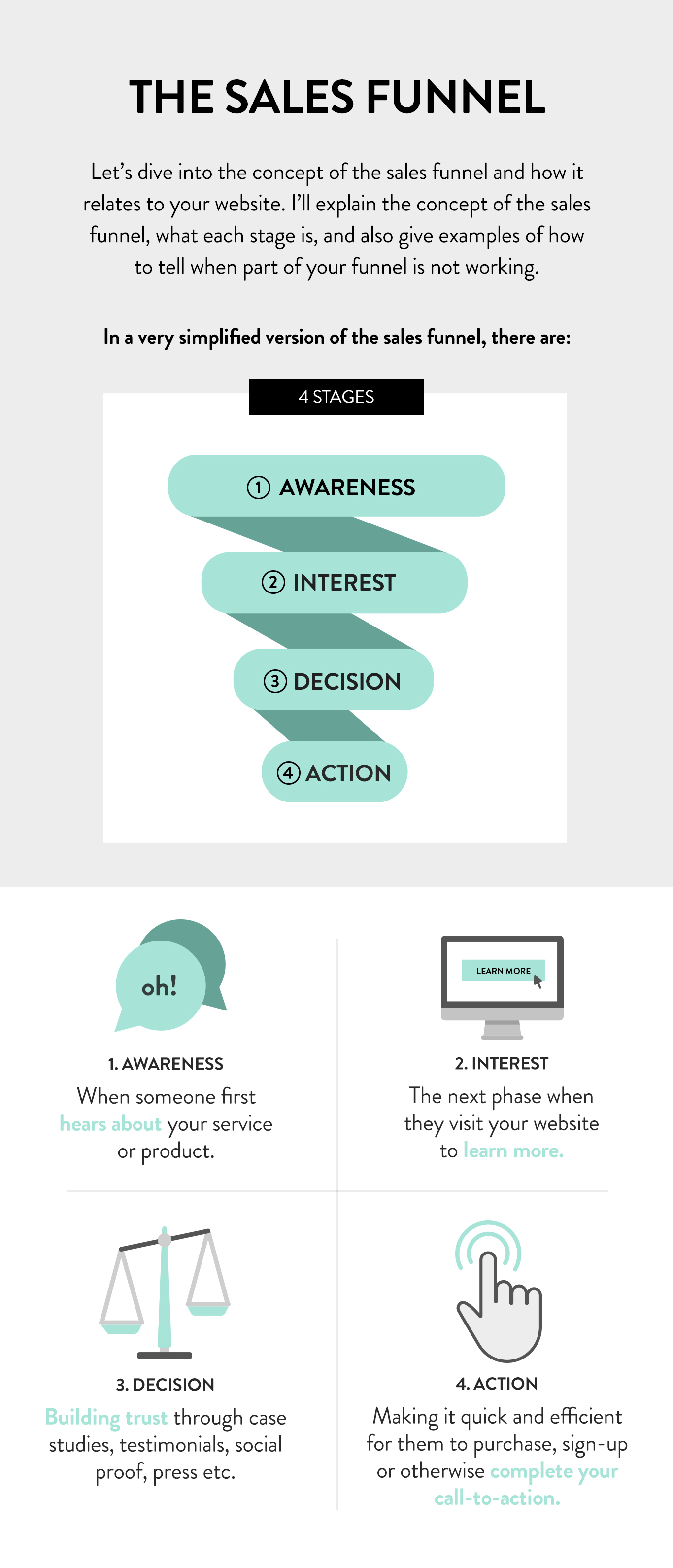
The Sales Funnel and How It Applies to Your Website
The sales funnel is your customer’s journey from first becoming aware of your brand — this can be social media, advertising, a blog post, Google search, word of mouth, etc. Then, landing on your website, becoming interested in your product, making a decision to buy, and finally, actually taking action.
With e-commerce like Handsocks, the goal is usually to have a user purchase a product — or at least sign up for the mailing list.
When a website works well it guides users through these steps, from answering quantitative questions during the interest phase (what, where, when, etc.) to the more qualitative (how, social proof, reviews, mission statements, etc.) during the decision phase. Increasing motivation in the early stages is important, and when visitors have made the decision to buy, so is reducing friction so they can quickly go from the decision to buy to a successful purchase without trouble.
Video Walk through
I'm going to walk through the homepage and record my thoughts as though talking to the store owner, with the goal of providing some insight and actionable steps to improve it. Below in an abridged transcript of the video above.
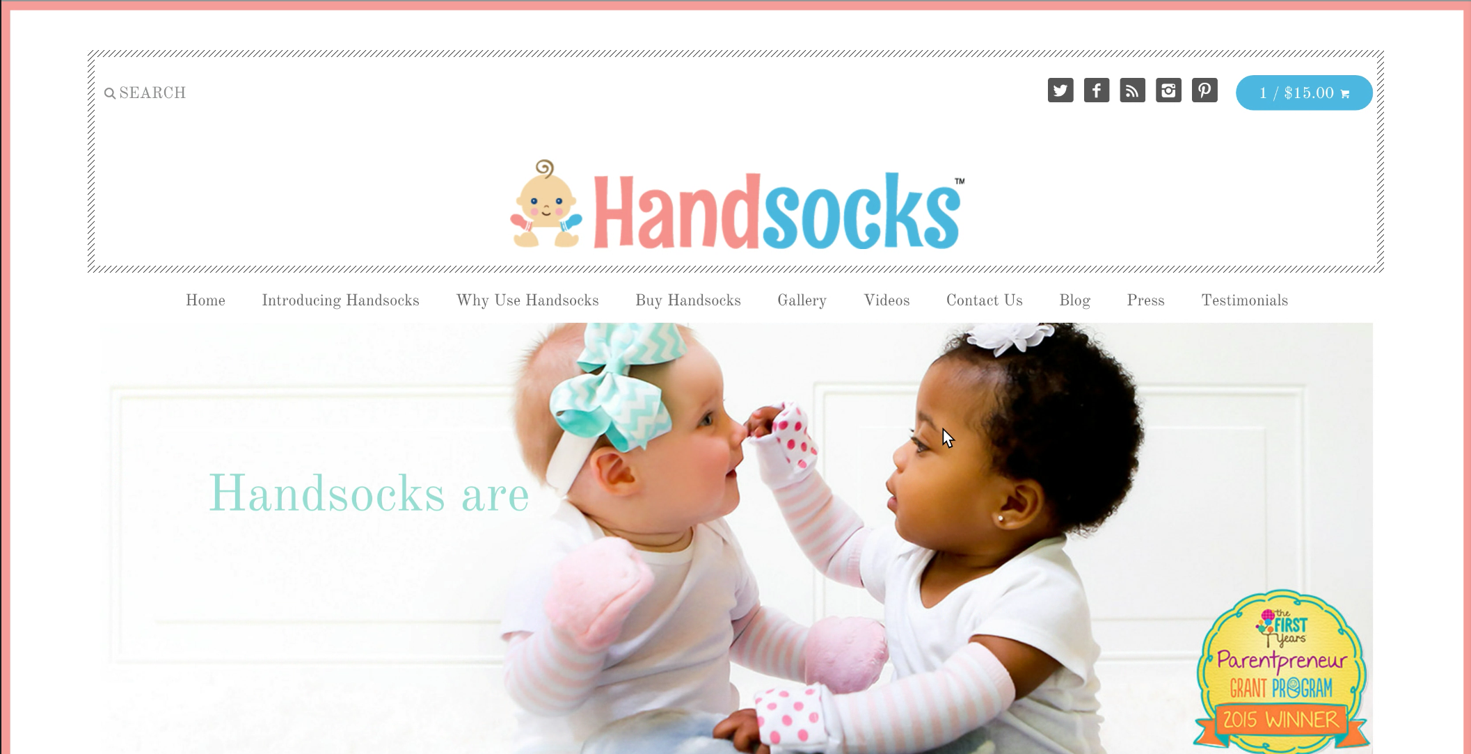
Header
Starting at the top of the page, the top row of navigation is taking up a lot of space and not doing much for you or the user.
With the search box, for instance, since you only have two products now, a better use of the space may be to either get rid of the search box or use that space for a sign-up to your mailing list.
Similarly with the social media icons, I think it's great that you’re on so much social media, but studies have shown that social media icons tend to cause higher bounce rates since users start thinking about Facebook or Twitter, click on the icon and bounce off your site.
Keeping them in your footer, if you must have them at all, so the user has a chance to get through a whole page of your content — but I’d recommend against having them at the very top of your page.
Now we're to the logo — I like your cute little logo with the baby in handsocks. Personally, I’m a big fan of taglines for smaller brands. They help explain what you do and also provide a hint of personality as well for visitors arriving at your site for the first time or who aren’t familiar with you.

Navigation
Moving to the main navigation, there is a lot of information here, but the section you actually want visitors to click on is “Buy Handsocks” — which is hidden in the middle of all these other navigational items.
Obviously you’ve created a lot of great content for your product that you want to showcase and use to drive traffic to your site. But the way it is presented here, the message is getting diluted.
The current trend in e-Commerce is creating long-form landing pages for each product. Instead of having a buy page AND a gallery page AND a video page, you incorporate pictures or videos on the actual product page. This also helps with SEO because all the video search traffic will land on your product pages, where users can go directly from watching your video to purchasing your product.
And this helps with high-information customers who want to do a little research about the product before purchasing. If all of the core product information is on one landing page, it definitely smooths the path from research to purchasing.
In short, if you condense the navigation and put things like the gallery, videos, and press testimonials within a longer product landing page, I think your conversions will start to increase.

Rotating Banner
Moving to the rotating banner. As a designer, I love these rotating banners because no one can ever decide what they want to have on their main banner and it’s really easy to say “okay, let’s just throw everything in there and make it rotate!” However, the problem is that studies show that rotating banners tend to lower conversion rates. Since you only have two products, I would suggest picking one great image and use the banner to fully explain your unique value proposition: what it is about your product that makes it so much better than all the other products out there. And have it be static. Obviously, you can change it periodically so your website looks refreshed — but just have one at at time.
As a side-note, I really like the award seal, that’s great for building trust and authority, so definitely keep that on all the banners you use.

Buy Handsocks
Down below the banner in the sales area, I think we might rename the area something like "Buy Handsocks" to show the user that this is an area for making a purchase.
One of the things I find a little confusing on the site is, I'm not exactly sure what separates No Scratch Mittens from Plushy Mittens. Here I can see that one is for a slightly different age group, but at first I thought, since once was pink and one was blue it was boys vs. girls, but reading a little bit closer I realized they're for both sexes. So now I’m not sure if it’s seasonal (winter vs. summer) or what the distinction is. If you could add a little text here that explains which one I should buy for which situations, that would be really helpful.
Also, instead of having this one big "Shop Now" button, I would have two separate shop buttons that link directly to the product landing pages. Ideally a customer can say, "Oh yes, the no scratch mittens is exactly what I need!” and very easily purchase a pair. Right now the user flow goes to the multi-product page where the user has to again select which product they want, and then finally get to the page where they can make a purchase. It’s not the end of the world, but each step like that creates friction. Our goal is to take customers as quickly as possible from the idea that they want something to actually purchasing it.

Videos
Moving down the page, I like that you have so many videos — that's great. YouTube is the world's second largest search engine and is quite underused by most brands, so it’s great that you’re utilizing it. From a design perspective, it would be nice to see the videos a bit larger, because when I hit play they start playing in that small box. You could either have a larger video to the left with a list of the videos and thumbnails to the right, or have the videos from the gallery automatically pop up and play larger when clicked — something to make them more prominent and the viewing experience more pleasant.

Image Links
The section with the four pictures across is nice. Unfortunately, the words are right across the cute little baby faces, but would be easy enough to fix either graphically or in the website settings.
As you change the main navigation and create product landing pages, you might need to periodically go back and rethink where these link to, but that will happen organically over time.

News and Social
News is definitely a red flag area for me. A big reason users bounce off sites and don’t go through with a purchase is out of fear the site is abandoned. So, if they get to to the news section and it’s all 10 months old, their immediate thought is “Maybe no one is actually running this site anymore,” and are likely to head back to Amazon or another site they are sure will deliver the products.
That said, I poked around a bit more and it looks like you are keeping up with social media and a blog, so maybe this area should be converted to a blog feed, Instagram feed, or something that is updated frequently — and preferably automatically. But right now, seeing posts dated November of last year and news about Christmas in August might make someone a little nervous about making a purchase from the site.
It looks like your Instagram feed is not working, which is just a technical fix.

Footer
Getting into the footer, I think it's good that you have your mailing list going. I'd definitely put it in a few more spots, maybe have it in a pop-up or put it at the top of the page where the search field currently is. Also, a lot of places offer 10% or 15% discounts to incentivize users to sign up for their mailing list — that might be something to consider.
I think it’s great you have a secondary navigation down in the footer. Another way to simplify the navigation at the top of the page is to put some of the less commonly used items, like Contact Us, only at the bottom of the page so users can find them, but out of the way and not cluttering the top.
Additional Notes
With social media, I know it’s very time consuming to keep it up to date, so I might recommend focusing on one or two channels and not trying to maintain so many — for instance, it looks like you’ve developed a good following on Facebook and Instagram, so maybe just focus on those two. When you’re larger you can expand into the others.
Another thing to consider on the homepage would be incorporating some of your press great mentions or testimonials, which could really help build trust.
I hope this video is helpful in improving the site — I'm excited to see how it evolves!
I would recommend Float.Design to people who need an understanding of how to better capture their target demographic online, whether that be creating something from scratch or changing around what you've got. We are so pleased with our experience!