
Why healthcare brands feel cold, and how to fix it
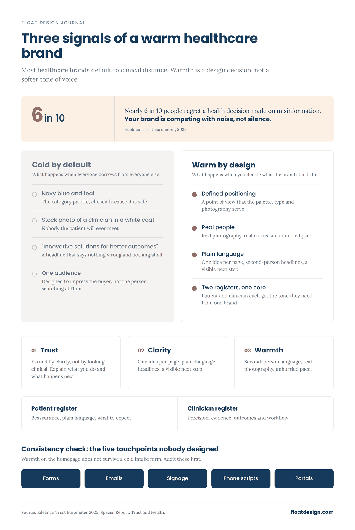
Walk through the websites of ten healthcare companies and you will see the same thing. Navy blue and teal. A stock photo of a smiling clinician in a white coat. A headline that says "Innovative solutions for better outcomes." Nothing is wrong, exactly. Nothing makes a nervous person feel any less nervous either.
That is the cold feeling. It is not a failure of taste. It is what happens in a category where everyone is afraid of getting it wrong, so everyone borrows from everyone else. The fix is to decide what your brand stands for, then design so that trust, clarity and warmth show up in every touchpoint.
Where the coldness comes from
Healthcare brands go cold for three predictable reasons.
The first is fear. Legal and regulatory teams are, rightly, cautious about claims. But caution about claims often turns into caution about everything, including tone, color and photography. The safest-looking brand wins internally, and the patient loses.
The second is the wrong audience in the room. Many healthcare brands are designed to impress the people who buy or refer, not the people who use. The patient, who is scared and searching at 11pm, gets the leftovers.
The third is a misunderstanding of authority. Teams assume authority looks like distance: formal language, empty white space. In practice, authority in healthcare looks like someone who knows what they are doing and is willing to explain it plainly.
Trust is earned by clarity, not by looking clinical
Trust is the whole game in this category, and the data suggests it is under strain. In its 2025 Trust and Health report, Edelman found that nearly six in ten people regret at least one health decision they made based on misinformation, and that among 18 to 34 year olds, 45 percent admitted to disregarding provider advice in favor of friends or family within the past year, and 38 percent in favor of social media.
Read that as a design brief. People are not short of information. They are short of sources that feel both credible and human. A brand that explains what it does in plain sentences, shows real people and is honest about what it cannot promise will out-trust one that hides behind jargon and gradients.
Clarity means one idea per page, headlines a tired person can understand on the first read, and a hierarchy that tells them where to look. It means naming the thing. "Fertility medication delivered to your door, with a pharmacist you can call" beats "Patient-centered specialty pharmacy solutions" every time.
Warmth is a system, not a color
The usual attempt at warmth is a peach tone and a rounded typeface. That helps a little. But warmth that holds up across a brand comes from a system of decisions.
Language. Second person, active voice, short sentences. Acknowledge the emotion without dramatizing it. "You probably have questions" is warm. "Empowering your health journey" is not.
Photography and illustration. Real skin, real rooms, real light. If you use illustration, give it a point of view rather than a generic corporate style. Show people at the moment that matters to them, not the moment that flatters the product.
Pace. Warm brands do not rush the reader. Space between sections, a clear next step, and an absence of urgency tactics all signal that you respect the person's time and state of mind.
Consistency. The warmest homepage is undone by a cold intake form or an automated email that reads like a legal notice. Warmth is the sum of every touchpoint, which is why we treat identity and ongoing design as one continuous job.
Patients and clinicians want different things from the same brand
Most healthcare brands serve two audiences, and the mistake is to average them into one.
Patients want reassurance, plain language and a clear sense of what happens next. They scan, they read on phones, and they notice when a brand is talking past them.
Clinicians and buyers want precision, evidence and efficiency: specs, protocols, outcomes and a contact who will call back. They distrust brands that oversell.
The answer is not two brands. It is one brand with a clear core, expressed in two registers. The core is your positioning: what you stand for, who you are for, why you are different. The registers are the tone, depth and visual density you apply for each reader. A handheld diagnostic device can have a patient-facing story about access and a clinician-facing story about image quality, and both can look and sound like the same company. That takes deliberate work at the brand platform stage, before anyone opens a design file.
What good looks like, in principle
A women's specialty care practice moves away from an identity that reads as a lab, toward one that reads as a place where you are known. The palette stays sophisticated rather than pastel. The photography shows real patients and real conversations. The credentials are still there, but they sit inside the story rather than being the story.
A specialty pharmacy replaces "solutions" language with a promise about what it does for a patient on a hard week, then designs the packaging, the portal and the phone script to deliver on it.
None of this costs more than the cold version. It requires deciding what you stand for and holding to it.
Practical takeaways
Write your positioning before you pick a color. Coldness is usually a missing decision, not a missing designer.
Audit your touchpoints from the patient's side, starting with the ones nobody designed: forms, confirmation emails, signage, hold music.
Rewrite one key page in second person, active voice, with no category jargon. Compare it to the original.
Separate your audiences into registers, not brands. Same core, different depth and tone.
Replace at least one stock image with a real one.
Check that authority is coming from clarity and evidence, not from distance.
If your healthcare brand feels colder than the care you actually deliver, book a free consultation call and we will talk through where the gap is.
Sources: Edelman, 2025 Edelman Trust Barometer Special Report: Trust and Health