Sunny Optimism and Tranquility: The Colors of Spring 2016
It's officially the first day of spring, no better time to dive into Pantone's official top 10 list of spring colors. These include the two colors of the year, the soft pink Rose Quartz and periwinkle Serenity but broaden the palette — interweaving a combination of bright, bold colors and classic neutrals. The concept of transformation and a unisex palette also continues from the colors of the year with no distinction between the men’s and women’s color collections.


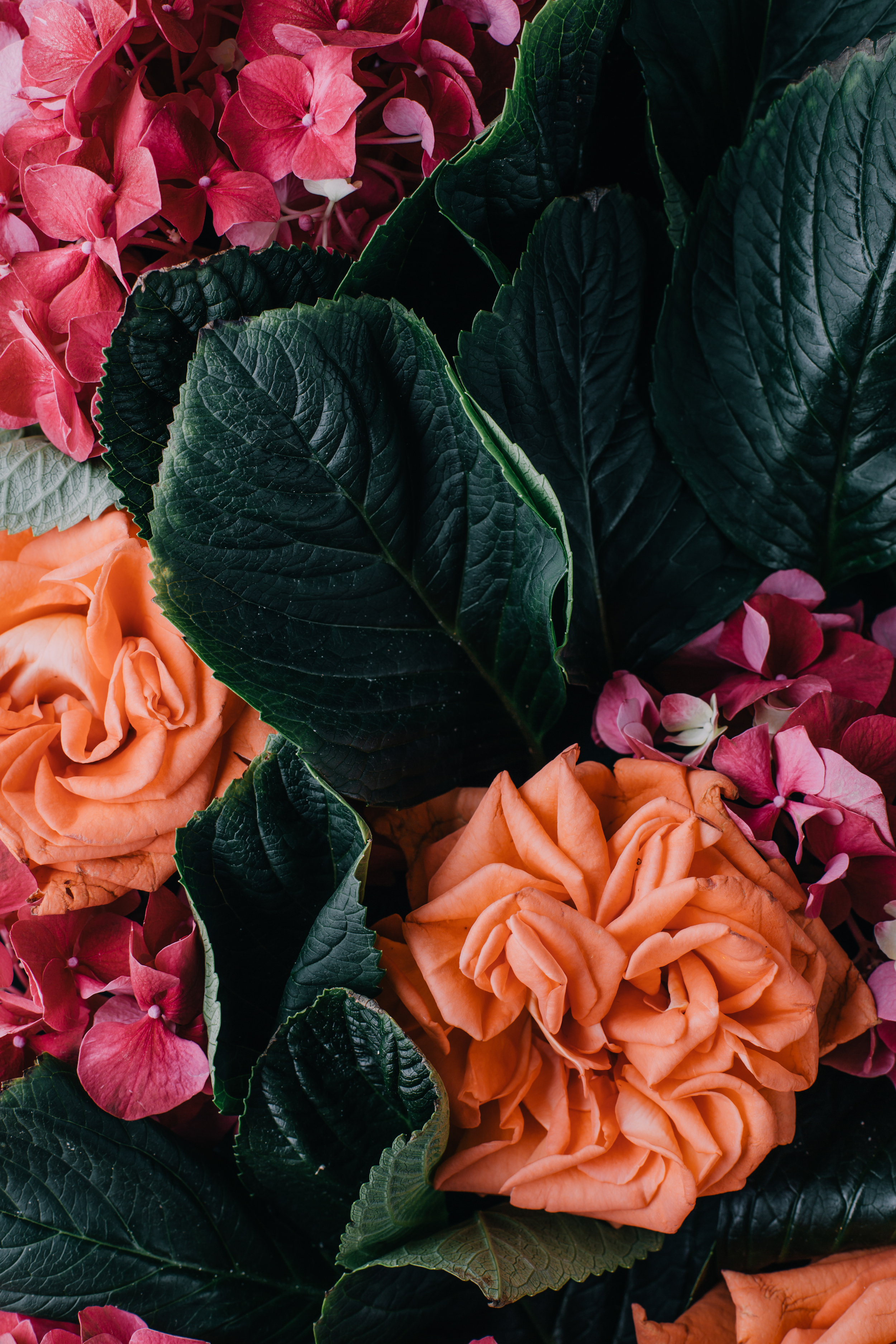
The orange and red-hues, Peach Echo and Fiesta bring warmth and excitement, contrasting with the overall gentle and tranquil tones of the palette.
Meanwhile the blues Limpet Shell and Snorkel Blue are clean, fresh and feel nautical.
Iced Coffee and Lilac Gray act as the neutrals, a earthy and natural foundation for the rest of the palette.
The most interesting and unexpected colors might be Buttercup and Green Flash — colors which are at once natural and organic but also bold and energizing.
Taken altogether, this palette reminds me of a happy, relaxing vacation at the seashore. I can’t wait to dive in and start incorporating them into our designs!